

Residential
East Victoria Park
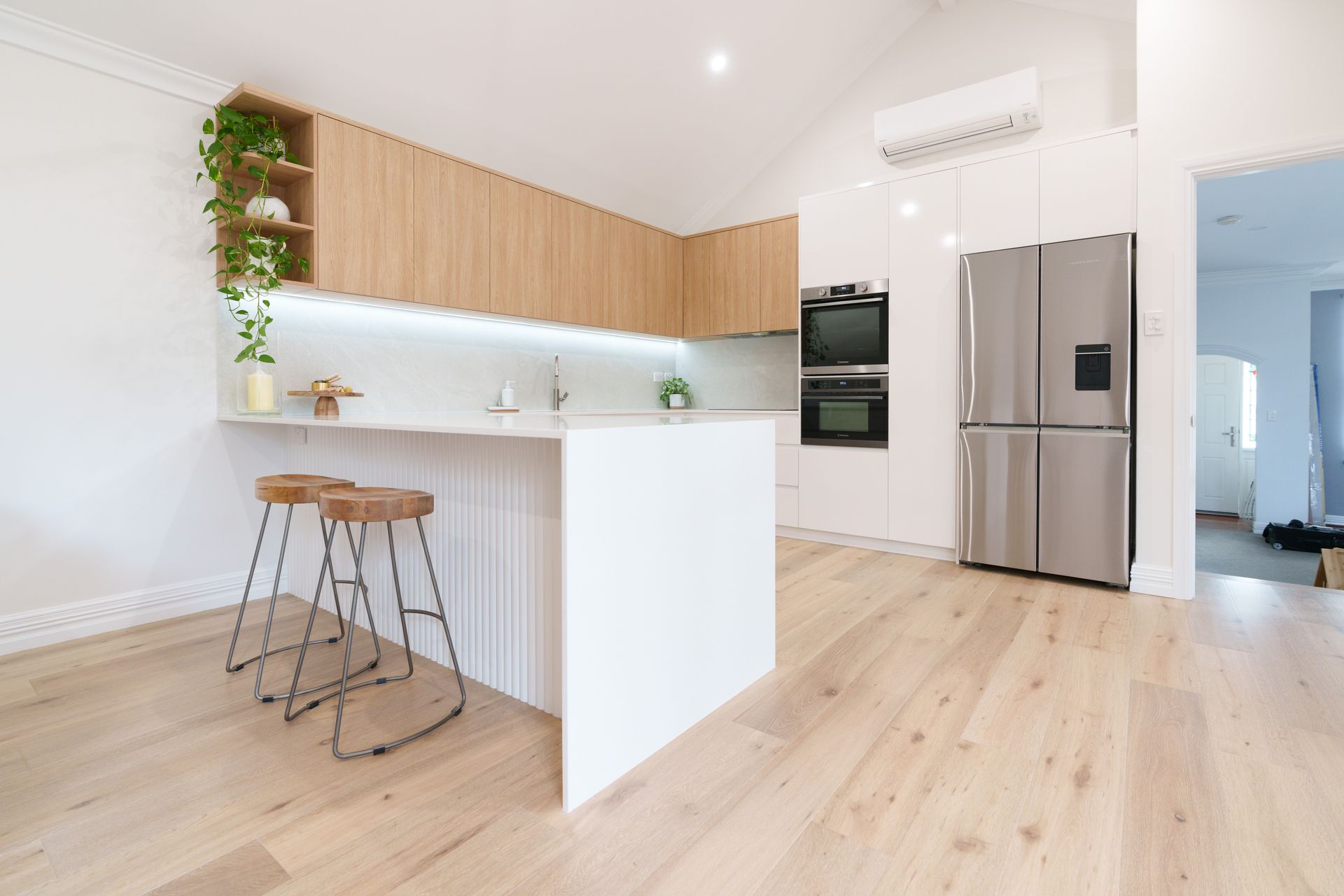
Leederville Residence This renovation focused on refining key functional areas of the home while creating a more cohesive and contemporary living environment. The project centred on the transformation of the kitchen, bathroom, and laundry, with careful consideration given to improving usability, storage, and overall flow. Existing layouts were reworked to better support everyday living, while maintaining continuity with the surrounding spaces that remained unchanged. A major focus of the renovation was the kitchen, where updated cabinetry, integrated appliances, an expanded island bench, and a revised pantry layout helped create a more functional and efficient central space. The bathroom and laundry were similarly refreshed through new finishes, fixtures, joinery, and improved spatial planning. Throughout the renovation, updated materials, lighting, and detailing were selected to create a cleaner and more cohesive visual language across each area, balancing practicality with a refined residential feel. The result is a considered renovation that enhances the functionality of the home while delivering a more resolved and modern day-to-day living experience.
Alfred Cove Residence The Alfred Cove Residence renovation focused on improving the functionality and flow of key living spaces while creating a more cohesive and contemporary home environment. The project centered on the transformation of the kitchen, living areas, bathroom, laundry, and ensuite, with careful consideration given to how each space supports everyday living. Existing layouts were reworked to improve usability, increase storage, and create stronger visual connection throughout the home. A major focus of the renovation was the kitchen, where updated cabinetry, integrated appliances, and a redesigned island bench helped create a more efficient and social central space. New glazing and sliding doors were also introduced to improve natural light and strengthen the connection between indoor living areas. Throughout the home, updated finishes, lighting, flooring, and joinery were selected to create a consistent visual language while enhancing long-term practicality and comfort. The result is a refined and functional renovation that modernises the home while supporting the way the owners live and use the space day to day.
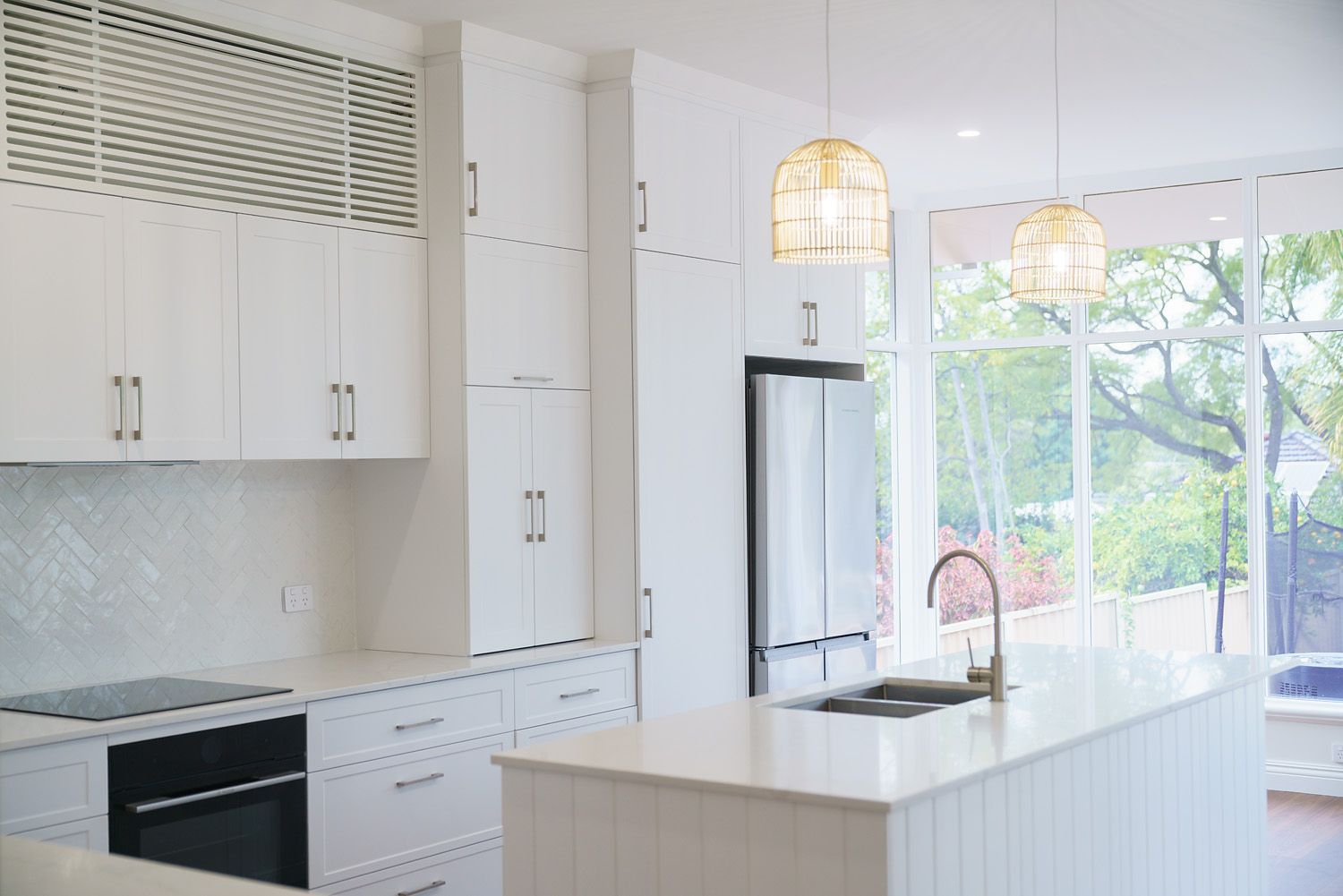
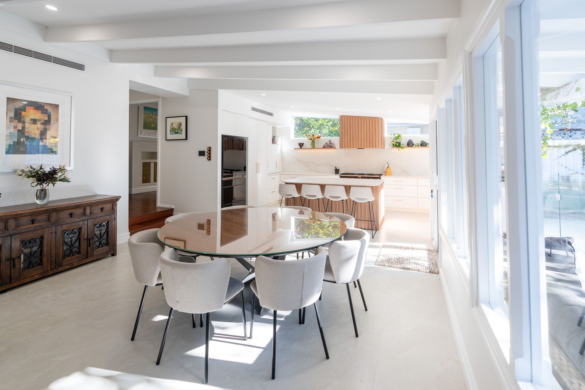
Newton Design Studio was brought in to solve a layout that no longer matched how the family actually lived — and to guide the project from that first conversation through to handover. The Floreat Home had reached a point where its layout no longer supported the way the family lived. Cramped living areas, limited natural light, and a weak connection to the outdoors made the home feel closed off despite its potential. The owners came to Newton Design Studio wanting a more open, connected environment — with the kitchen playing a central role in everyday life. Rather than handing them a design and stepping back, we worked through the full picture with them: what wasn't working, what the space needed to do, and how to get there without losing sight of the budget or timeline along the way. The design focused on breaking down internal barriers, letting spaces flow naturally and encouraging interaction across the home. By removing walls and introducing new glazing, we drew light deeper into the plan — managing the coordination between design intent and construction so nothing was lost between the drawing and the build. The reconfigured kitchen now anchors the open living areas, operating as a true family hub rather than a separate workspace. The result is a cohesive, light-filled home that supports connection, comfort, and long-term performance — delivered through one team, accountable from first concept to final handover.
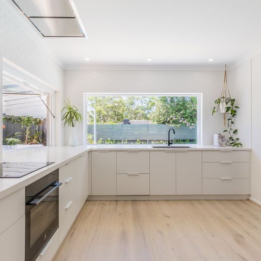
A closed-off 1980s double-brick home was reimagined to unlock its full potential. Through considered design, the space was opened to light, flow, and modern family living, creating a cohesive home with a refined coastal feel. The Wembley Downs Residence began as a classic 1980s double-brick home with strong bones, but a layout that felt closed off and fragmented. The owners knew they were sitting on an uncut diamond, but needed guidance through the design and delivery process to unlock its full potential. Their goal was to transform the home into a light-filled, open-plan space suited to modern family living and entertaining. A key challenge was the number of non-structural internal walls typical of the era, which created smaller, disconnected rooms and limited natural light. Newton Design Studio approached the renovation with a clear focus on opening up the central living areas. Strategic removal of internal walls and the introduction of large-format glazing allowed light to flood the kitchen, dining, and living zones, creating a more functional and cohesive layout. Material selections reinforced the fresh, contemporary feel, with white marble mosaic tiles contrasted against matte black frames and tapware. The result is a transformed home where the kitchen, laundry, and downstairs bathroom now form the vibrant heart of the residence, balancing strong practical performance with a bright, coastal-inspired aesthetic.
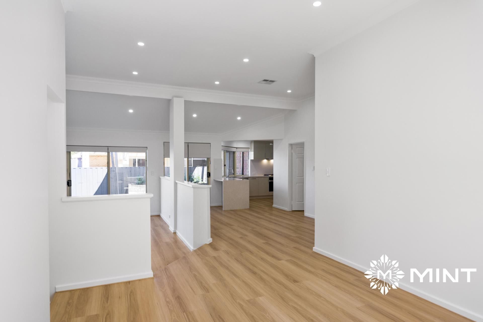
Designed with investment performance in mind, this renovation focused on upgrades that directly impact value. Functional improvements and material clarity elevated both rental appeal and asset efficiency. The result is a property that balances immediate yield with sustainable growth.
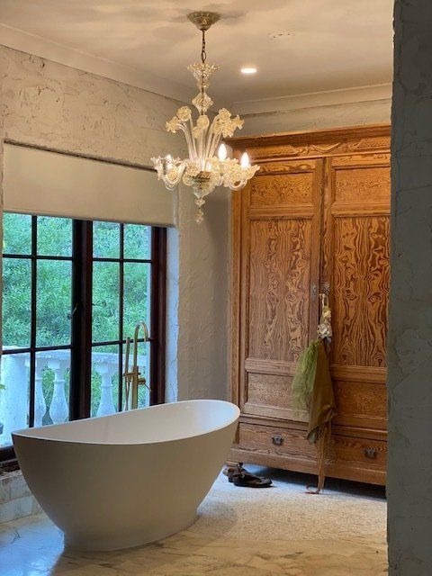
A strong European influence through the use of hand-crafted stones and cabinet work allowed the client to express their heritage and flare.
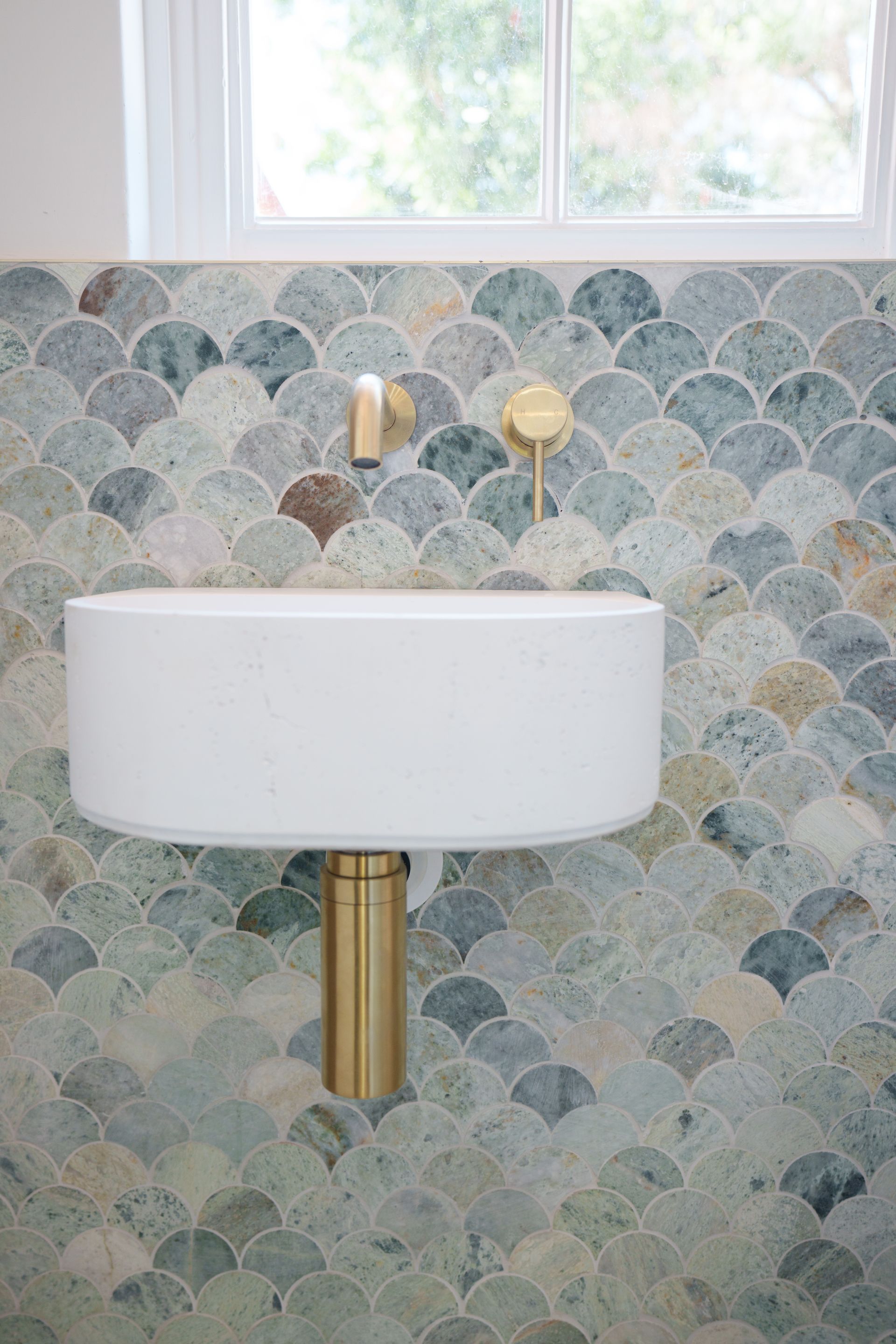
Newton Design Studio was brought in to solve a home where rooms were closed off, light stopped short of where it was needed, and the outdoors, so central to how the family wanted to live, was barely part of the picture, and to guide the project from that first conversation through to handover. The owners came to Newton Design Studio wanting something simple to describe and hard to achieve alone: a home that felt open, connected, and easy to live in, with the kitchen at the centre of daily life rather than set apart from it. We worked through the full picture with them first, what wasn't working, what the space needed to do for a busy family, and where the budget needed to hold firm. Every decision after that was guided by one question: how would this space actually be used. That meant identifying which walls could come down and where light could be drawn deeper into the plan, rather than designing for how the home looked in a photograph. Internal walls came down to open the living areas into one connected space, and new glazing was positioned to bring light through the plan rather than into a single room. Throughout construction, we managed the coordination between design intent and what was being built, so nothing was lost between the drawings and the finished home. The kitchen now anchors the open living space as a genuine hub, light moves through the plan instead of stopping at a doorway, and the connection to the outdoors is part of daily life. It's a home shaped around how people actually live in it, delivered by one team accountable from first concept to final handover.
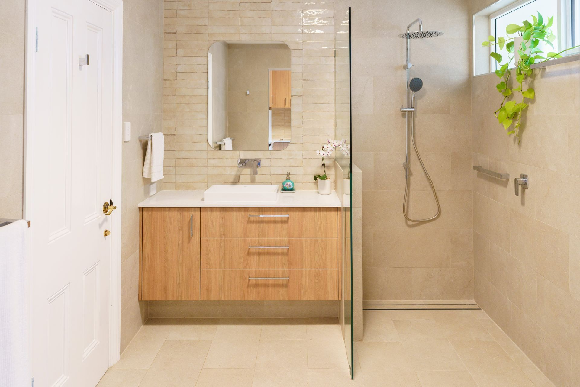
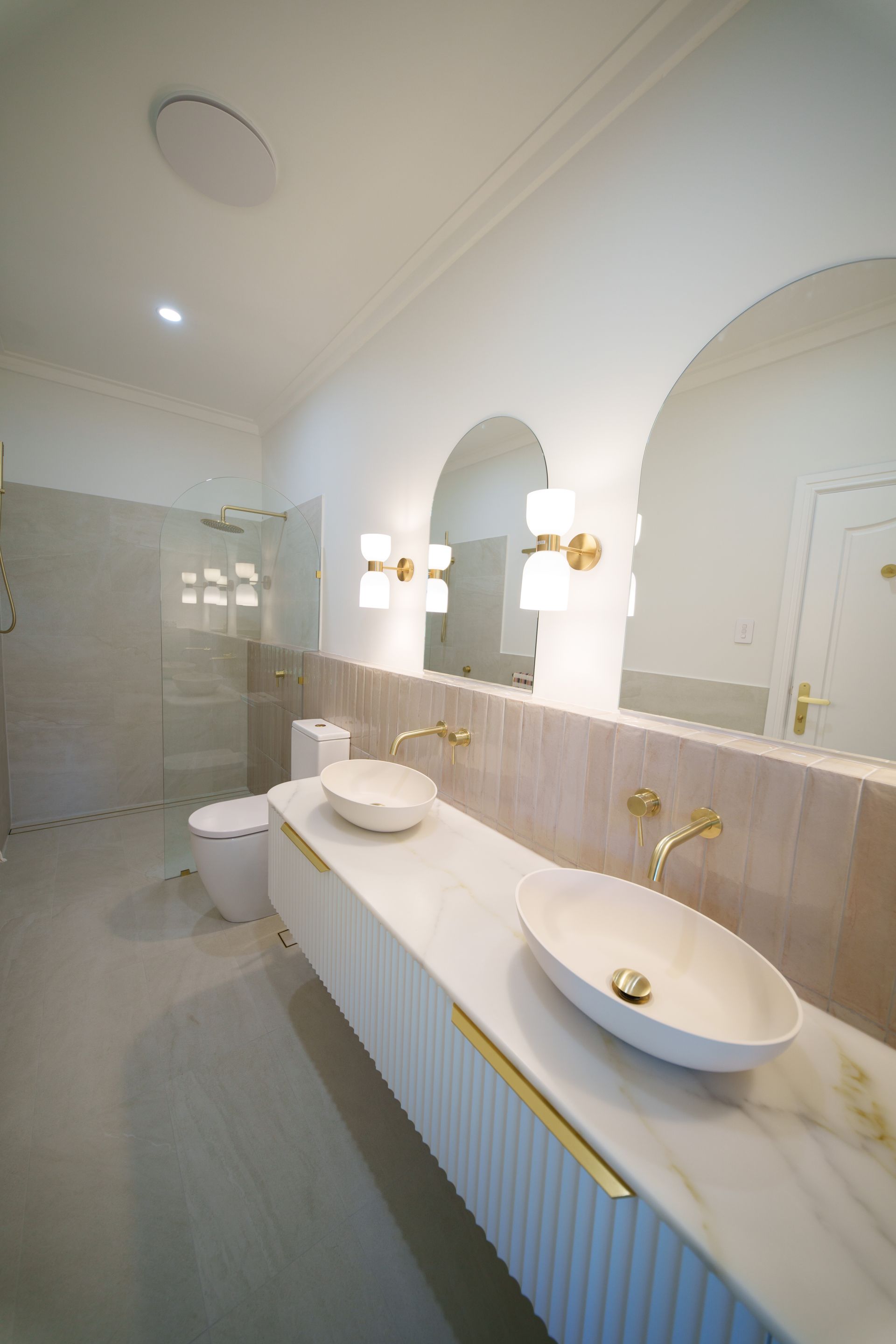
Designed to support the clients as they age in place, the Salter Point Residence focuses on comfort, safety, and clarity. Subtle design decisions improved accessibility without visual compromise. The result is a welcoming wet area that feels contemporary, calm, and enduring.
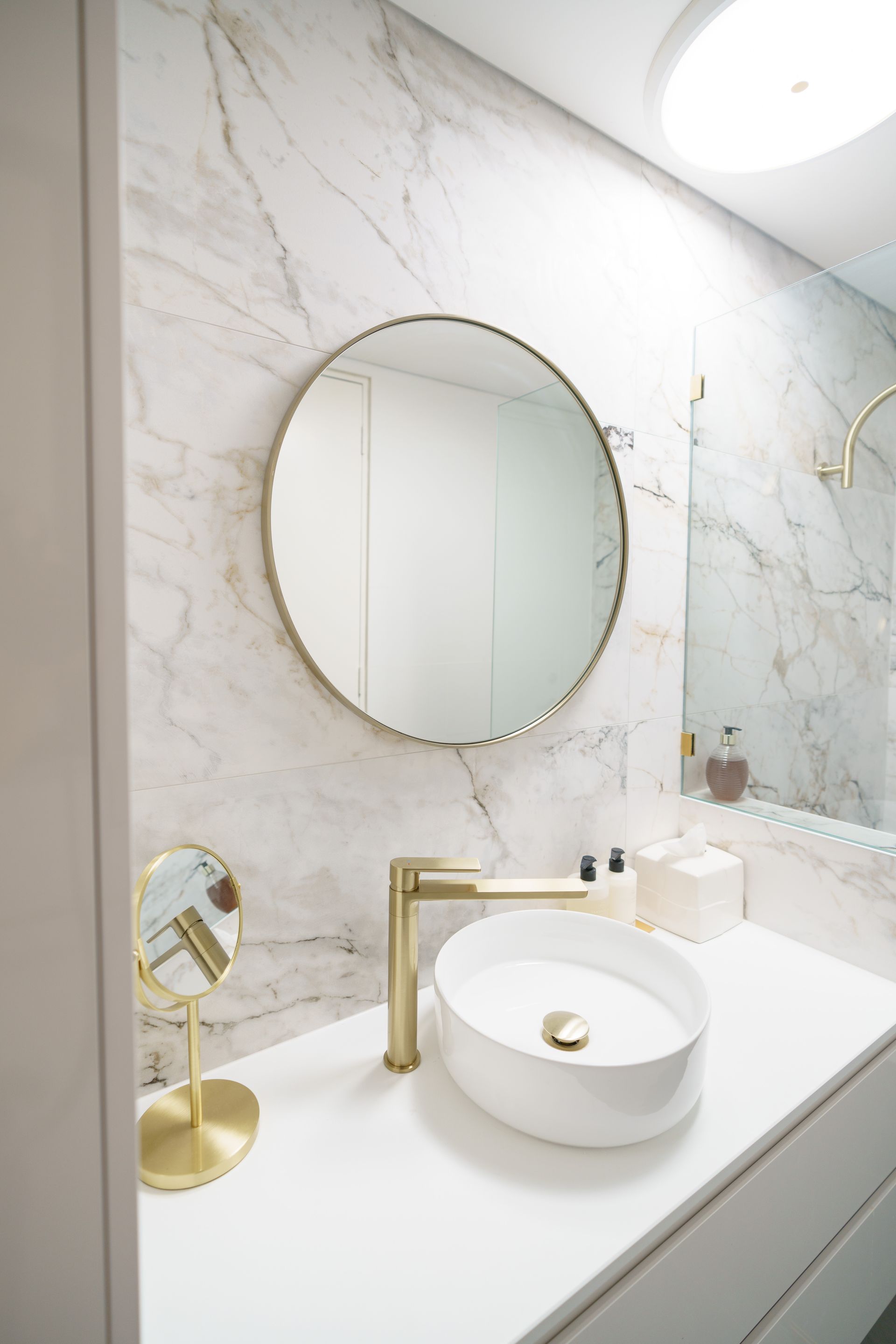
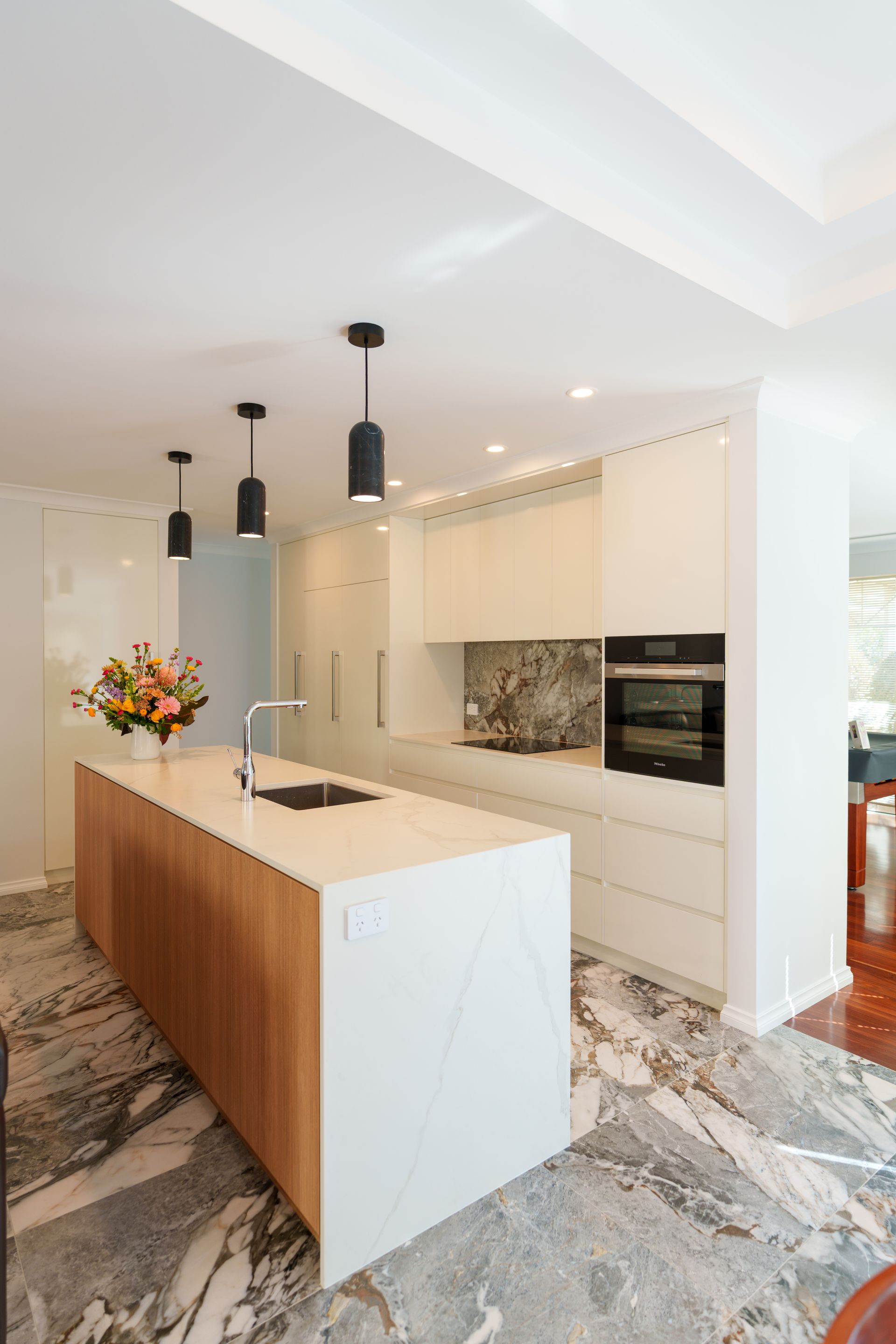
Newton Design Studio was brought in to solve an apartment whose dated, disjointed finishes no longer reflected the calm, considered home the owners wanted for their next stage of life, working within existing plumbing and structural constraints, and to guide the project from that first conversation through to handover. The owners were downsizing and wanted certainty as much as they wanted a beautiful result: a fixed price, no surprise costs, and a home that felt elevated rather than simply renovated. We worked through the full picture with them early, including what the existing plumbing and structure would and wouldn't allow, so the budget held firm from day one. With the layout largely fixed, the design thinking shifted to precision. Every material and detail had to earn its place, since there was no room to hide an unresolved choice behind a change in floor plan. Highly detailed drawings meant the build could proceed with fixed pricing and no variations along the way. Brushed brass and gold select porcelain carry through the kitchen, bathrooms, and laundry, and a new waterfall benchtop anchors custom cabinetry built for how the owners actually cook and live now. The apartment now feels calm, cohesive, and unmistakably considered, exactly what the owners pictured for this next stage of living. It's a result delivered with cost certainty from concept to handover, by one team accountable for every decision along the way.
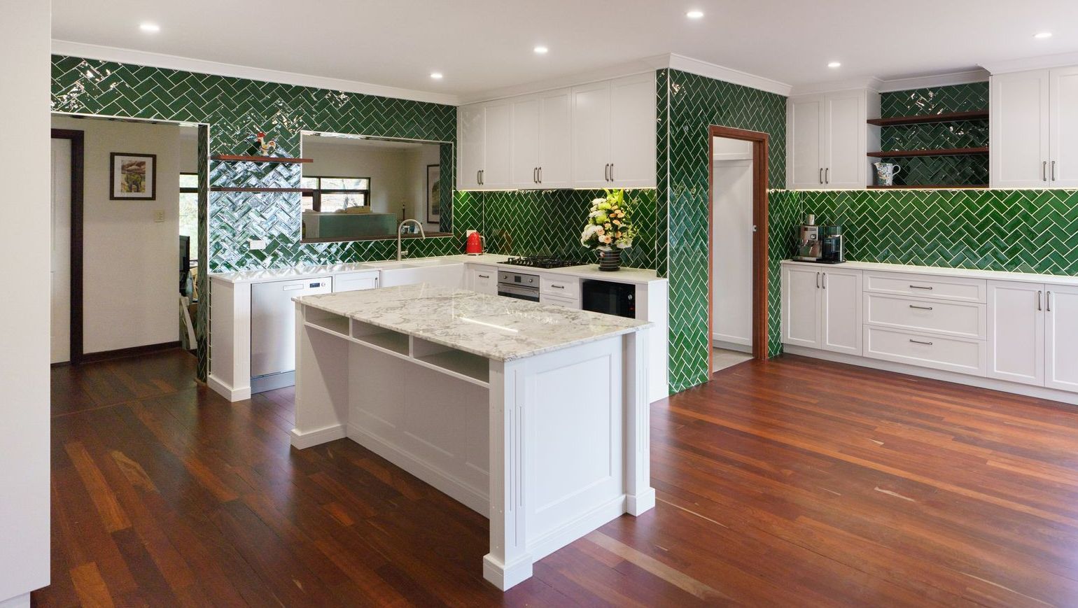
Set within an elevated landscape, the Hills Residence was redesigned to better engage with its surroundings. Reorienting the layout and introducing expansive glazing strengthened the connection between inside and out. The result is a calm, light-filled home shaped by its setting.
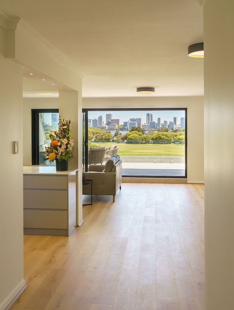
With its outlook underutilized, this 1970s apartment called for a more responsive layout. Strategic structural interventions opened the living areas to light and view, transforming how the home is experienced. The completed renovation delivers a calm, high-performing space tailored to everyday living.
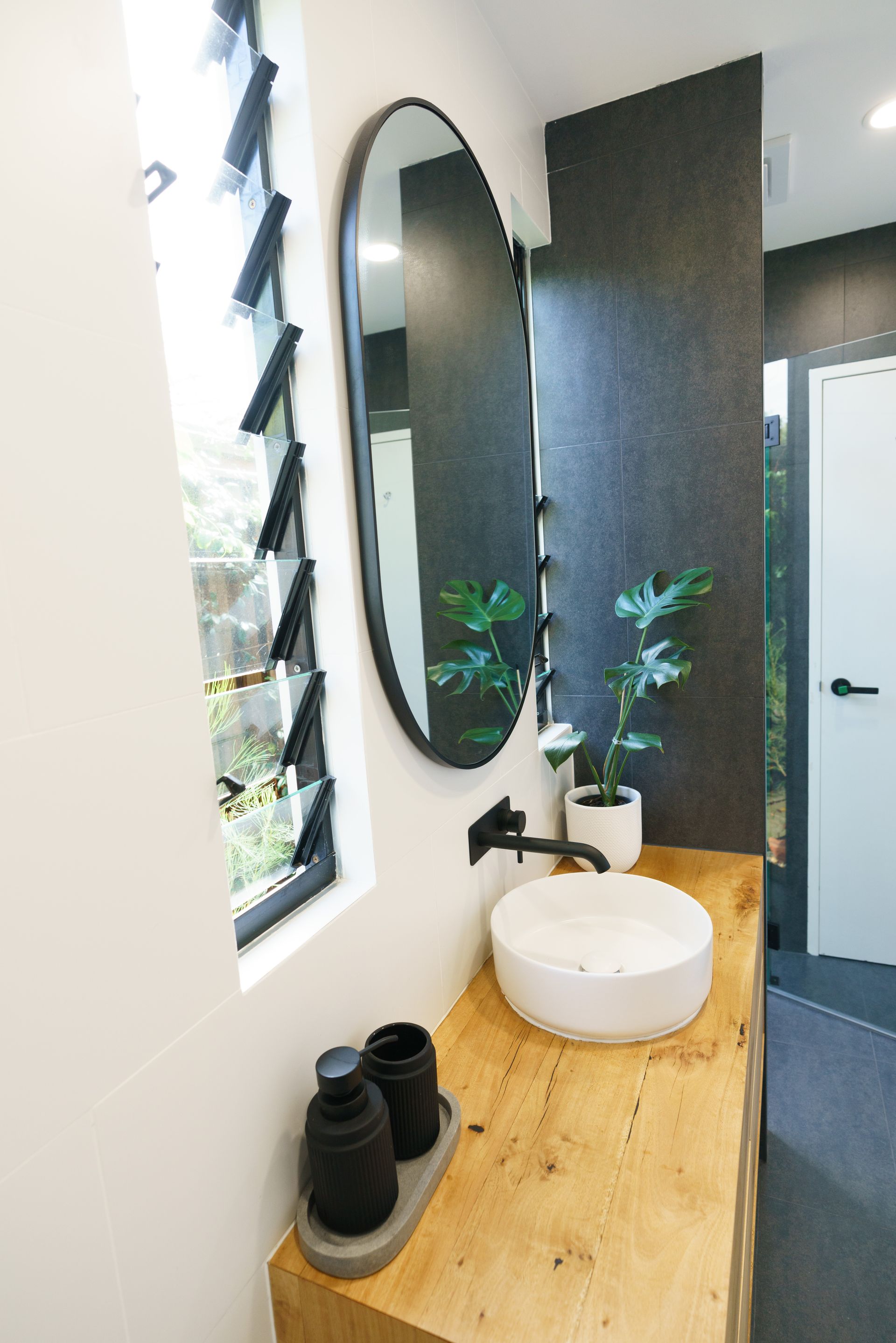
The Manning Residence was reworked to better support the demands of modern family life. Opening up the home’s core living areas improved flow, light, and everyday usability. The result is a brighter, more functional home designed for connection and long-term comfort.
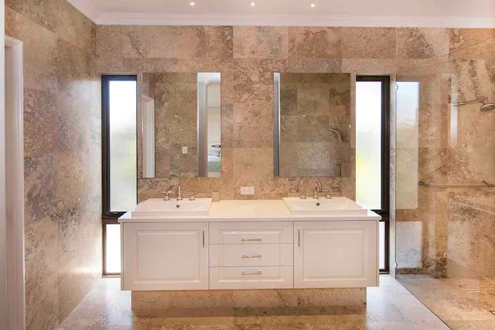
From a base build we have full design input to capture the client's vision for a spacious, light and warm finish. Natural stones in keeping with the surroundings were a real highlight.
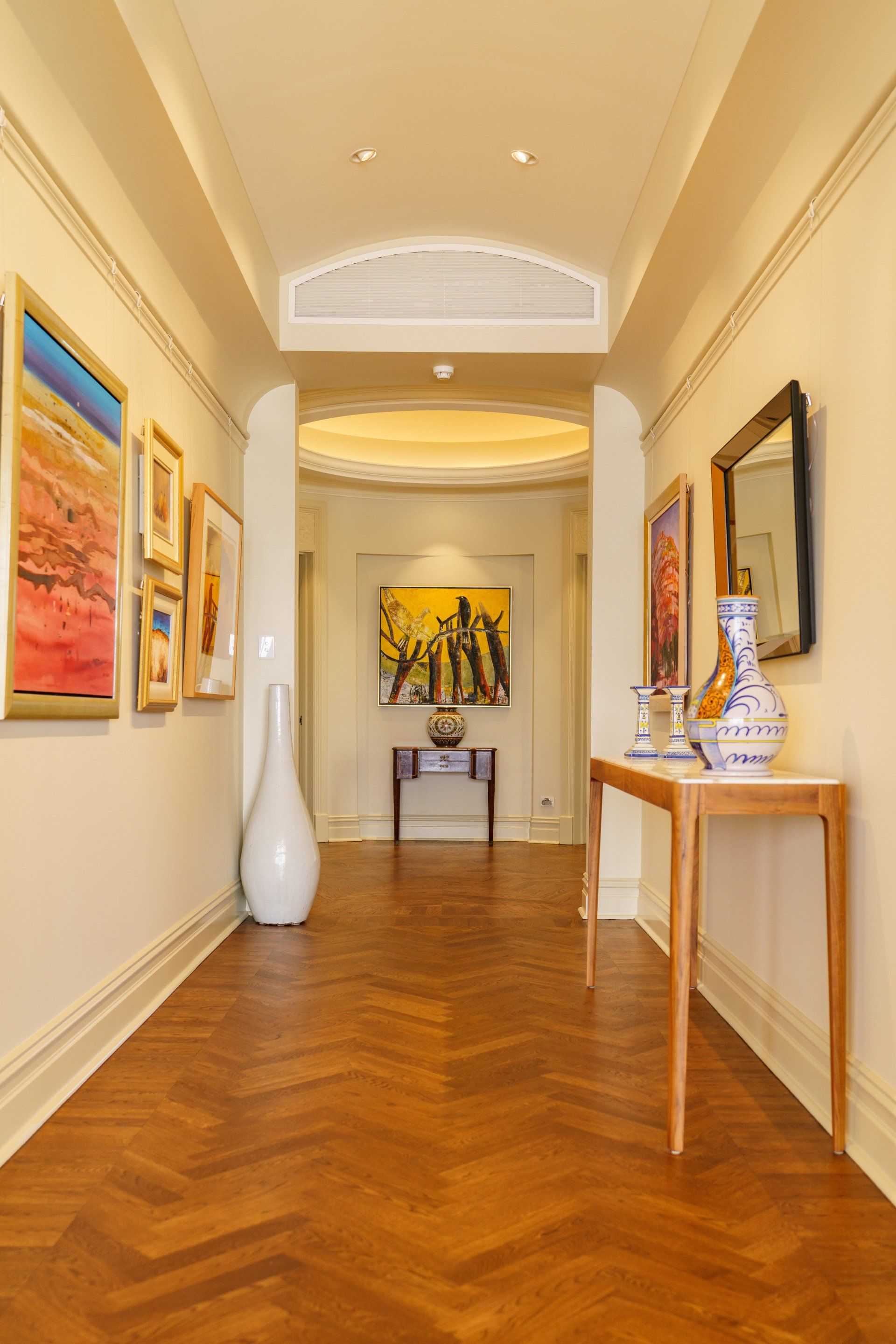
This renovation transformed tired flooring, wall finishes and cabinet work into an amazingly warm and contemporary space.
Commercial
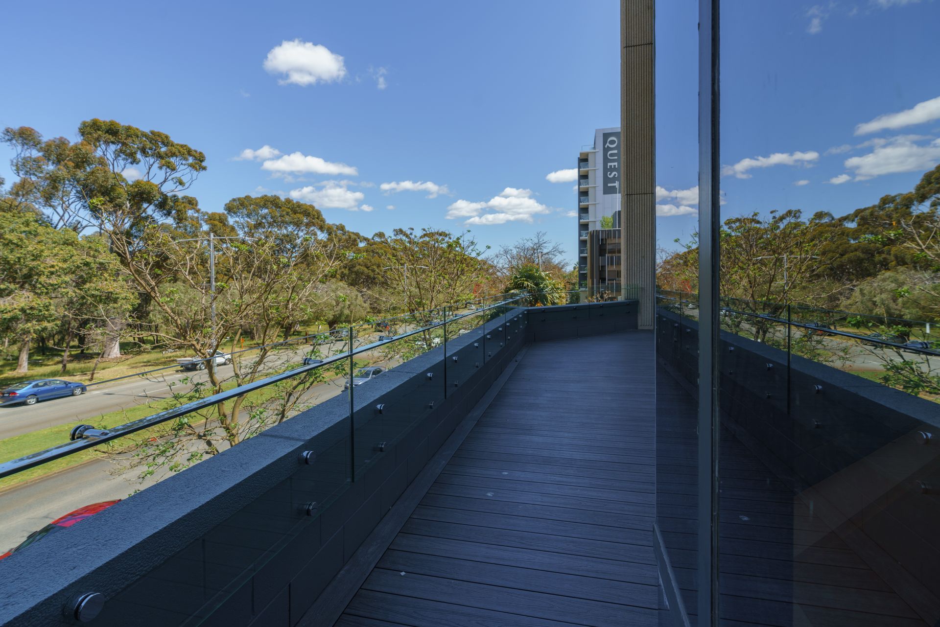
Kings Park Road, West Perth
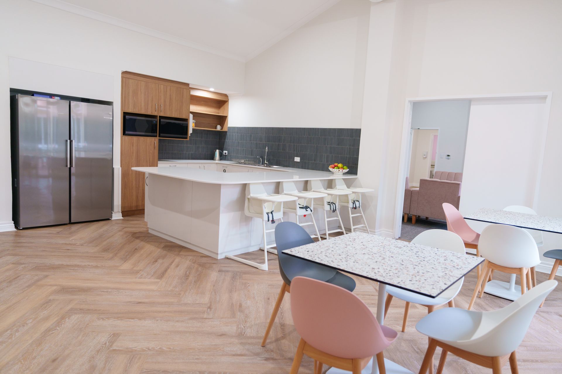
Ngala Childcare
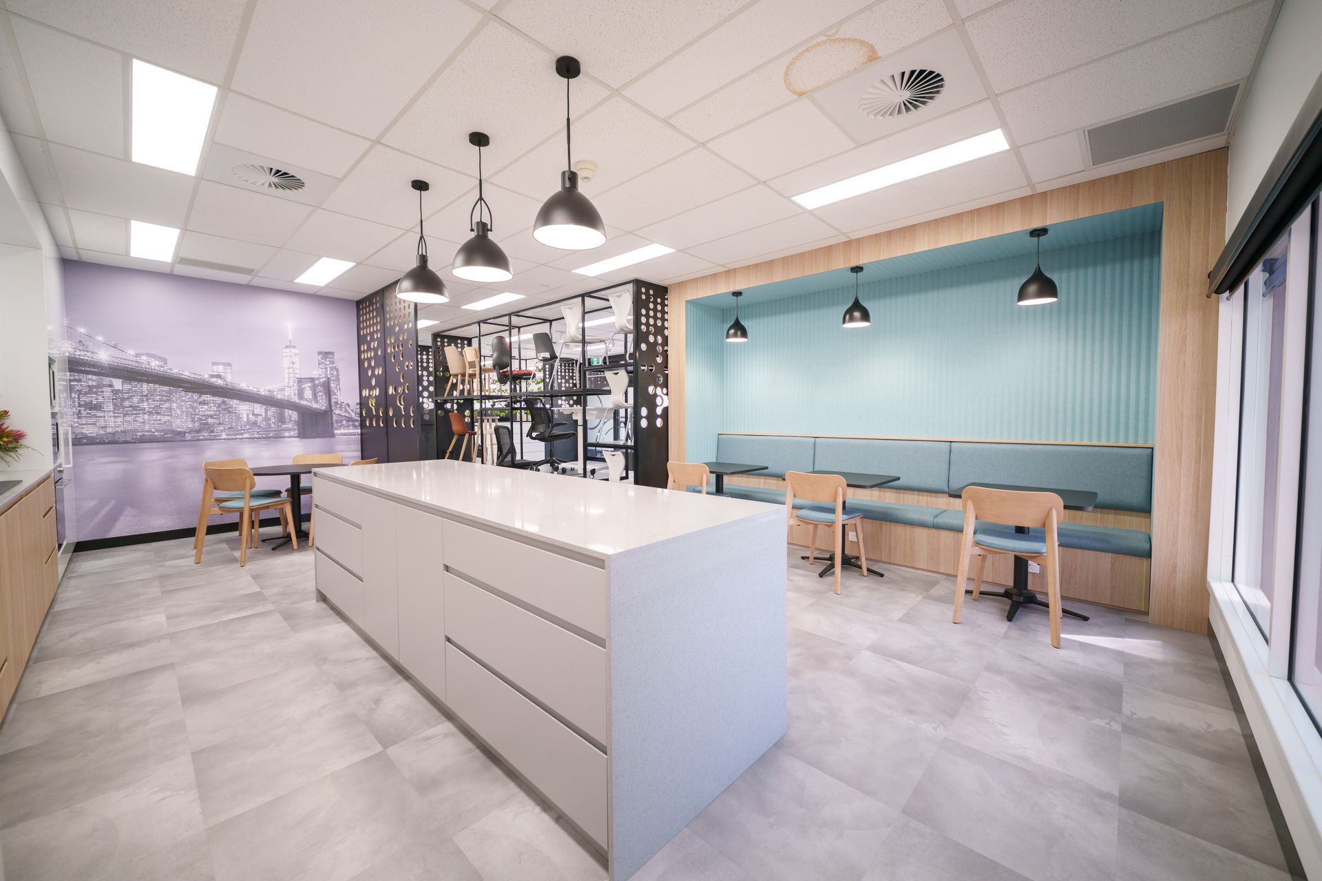
Office Line – Canning Vale Office The Office Line project focused on the redesign of a 250 square metre office space, creating a workplace that balances functionality, flexibility, and a premium client experience. The layout was carefully planned to support both day-to-day operations and future business growth, incorporating private offices, meeting rooms, open-plan work areas, and dedicated breakout spaces within a cohesive environment. Particular attention was given to how teams interact across different functions, ensuring the workspace could operate efficiently while adapting to evolving staff requirements. A central focus of the project was the integration of showroom and client-facing areas within the office environment. Product display zones and meeting spaces were designed to support presentations, demonstrations, and informal client interaction, while reinforcing the company’s positioning and service quality. The design approach combined spatial planning with carefully considered finishes, lighting, glazing, and furniture layouts to create a professional and well-resolved workplace experience throughout the tenancy. The result is a flexible and contemporary office environment that supports operational performance while delivering a stronger experience for both staff and clients.
Clean and sophisticated office fit out centered around inspired productivity.
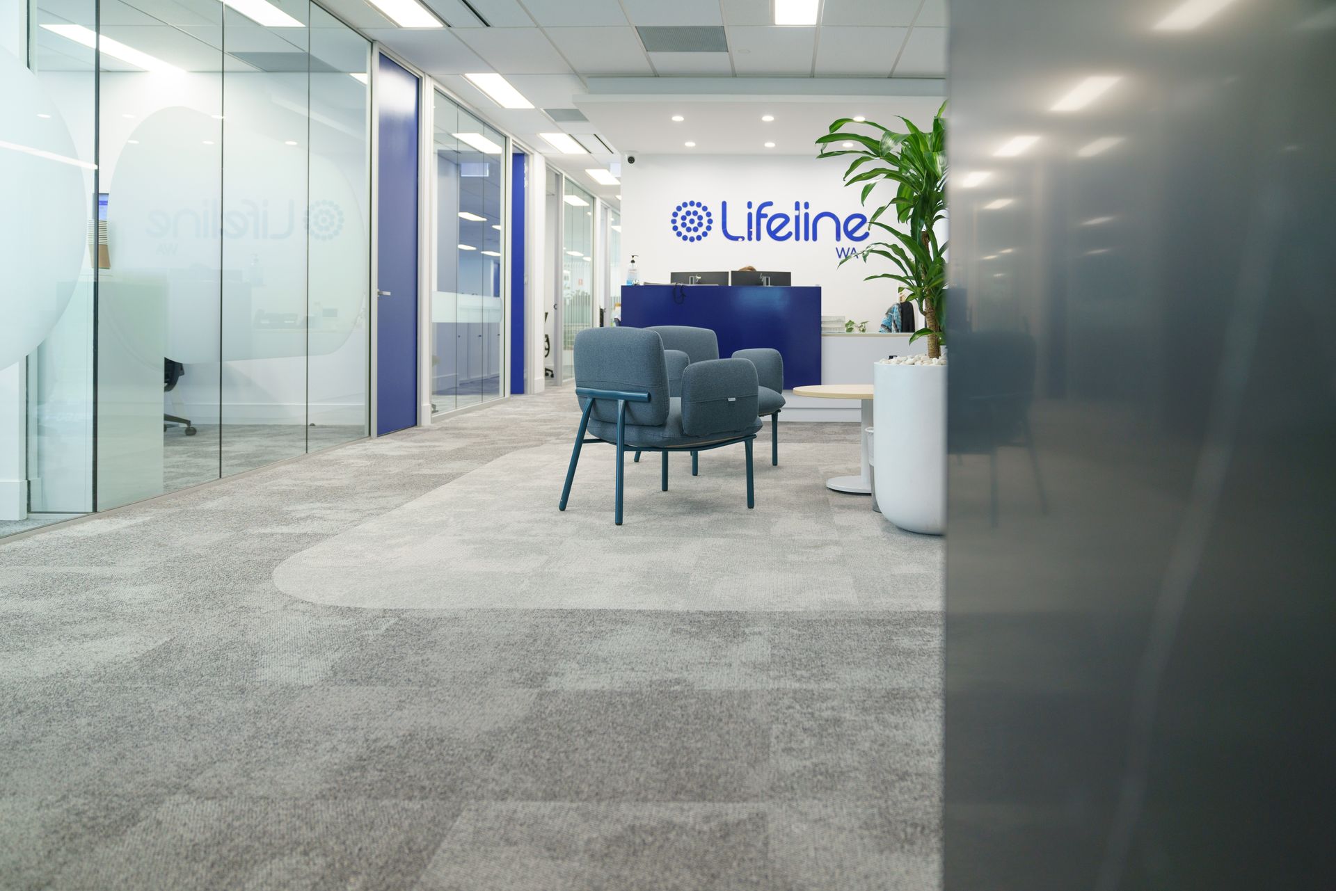
An inspiring corporate office with fun, bold accents. The Lifeline WA office refurbishment focused on improving both the design and day-to-day functionality of the space, without disrupting core operations. Working within the existing layout, the project targeted shared areas where change would have the greatest impact. Breakout spaces, kitchens, and amenities were rethought to better support staff use, while creating a more cohesive and considered environment. A full strip-out allowed the space to be rebuilt with clearer zoning, improved lighting, and durable finishes suited to a high-use workplace. New partitions and glazing helped organise the layout, balancing openness with defined work areas. The result is a workplace that not only functions more efficiently, but feels more resolved, supporting both practical use and the overall experience of the space.
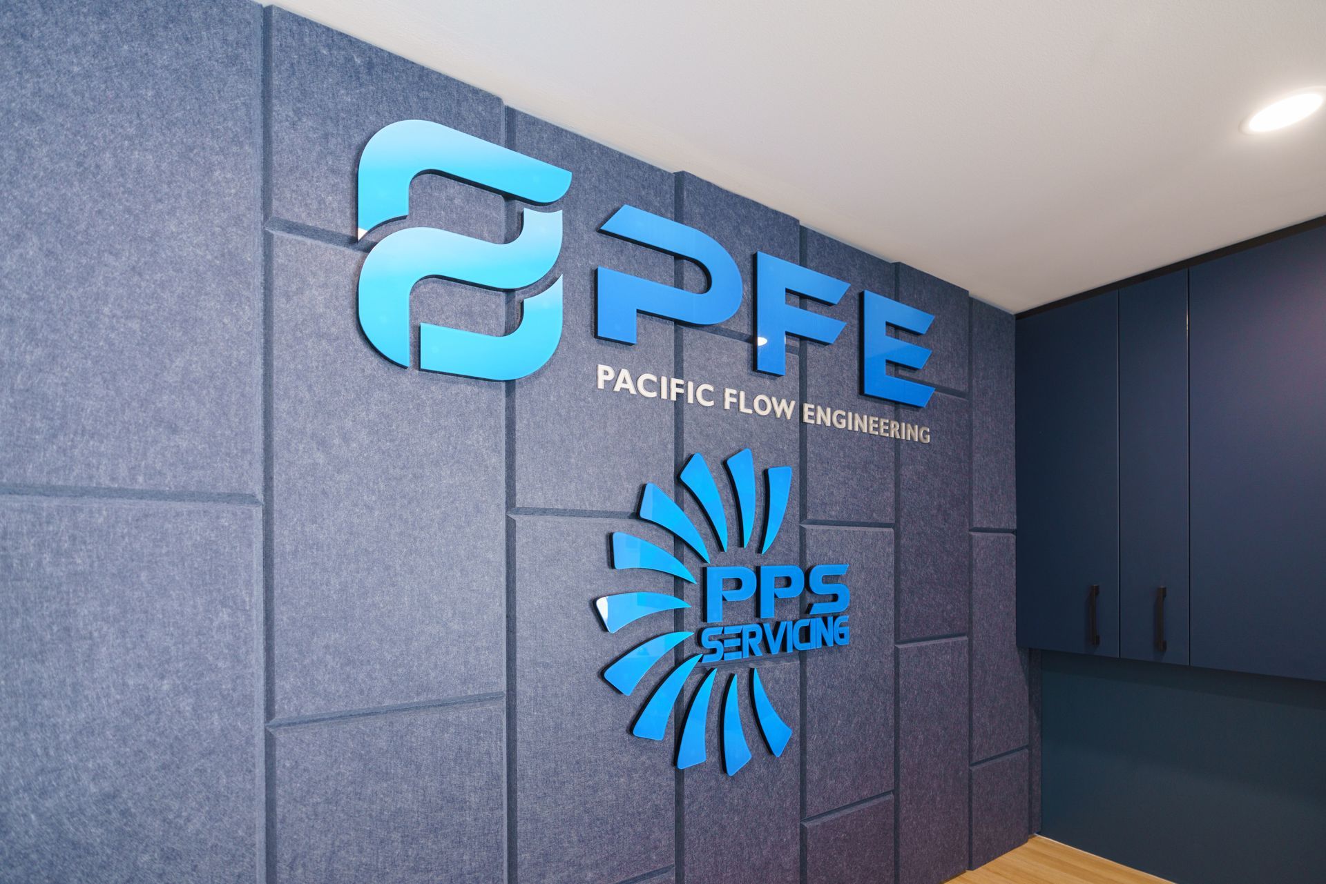
A commercial space designed for collaboration. The Pacific Flow Engineering office project focused on improving both the design and functionality of an existing commercial tenancy, with an emphasis on spatial efficiency and future usability. Working from the existing layout, the project required a clear understanding of site conditions to support proposed modifications, including the introduction of a new mezzanine level. This required careful planning to ensure the space could evolve while meeting approval requirements. The approach centred on detailed site analysis and documentation. A full site survey informed the development of accurate drawings, including demolition plans, updated layouts, and reflected ceiling plans, along with elevations to support the integration of new structural elements. The documentation package was prepared to meet strata and council requirements, providing a clear pathway for the project to move forward with confidence. The result is a well-resolved planning framework that supports the transformation of the tenancy, allowing the space to be developed with greater efficiency, structure, and long-term flexibility.
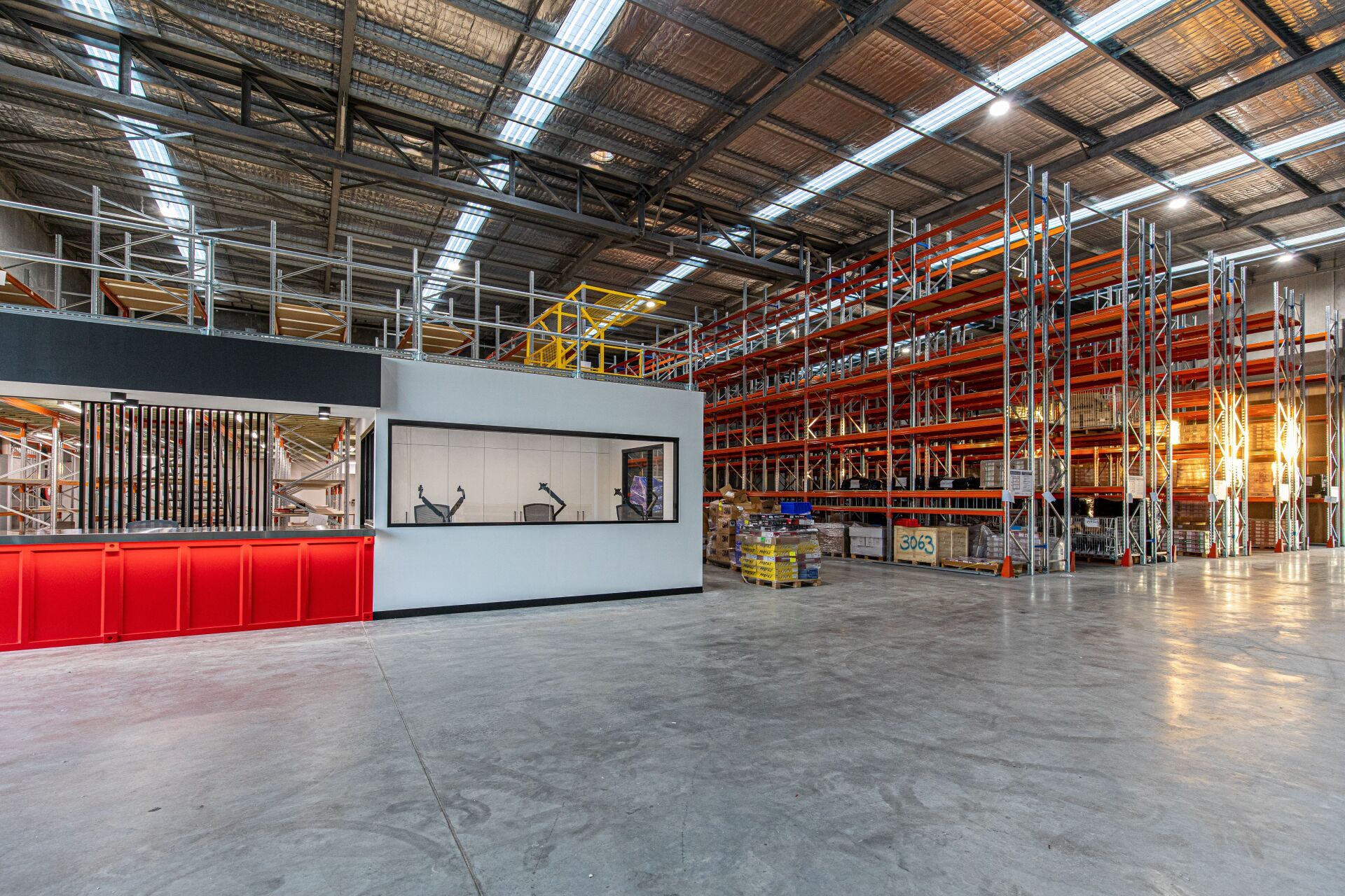
Blending functional warehouse space with contemporary office design.
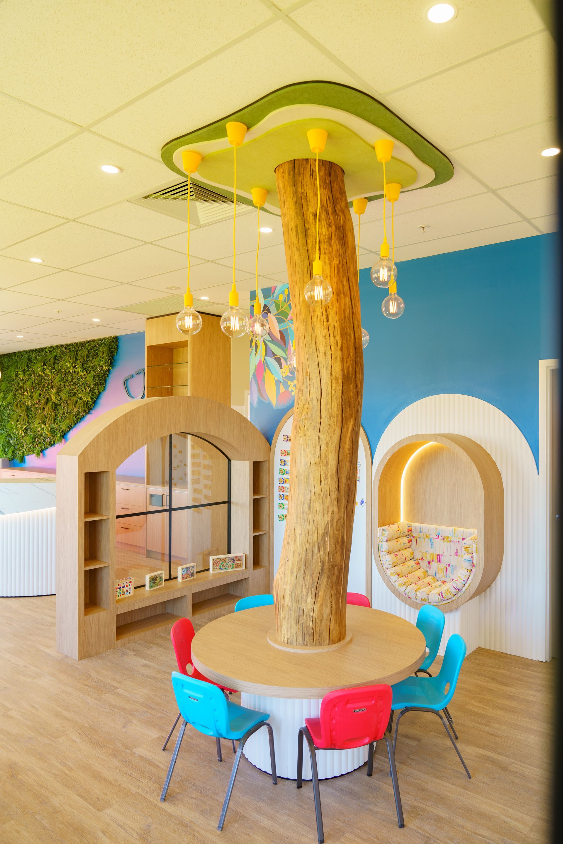
This paediatric clinic required a friendly, inviting and happy space for children and their parents to engage with. The use of bright, calming colors and the creation of a fun and entertaining space for children to wait was what the client was looking for in this project.
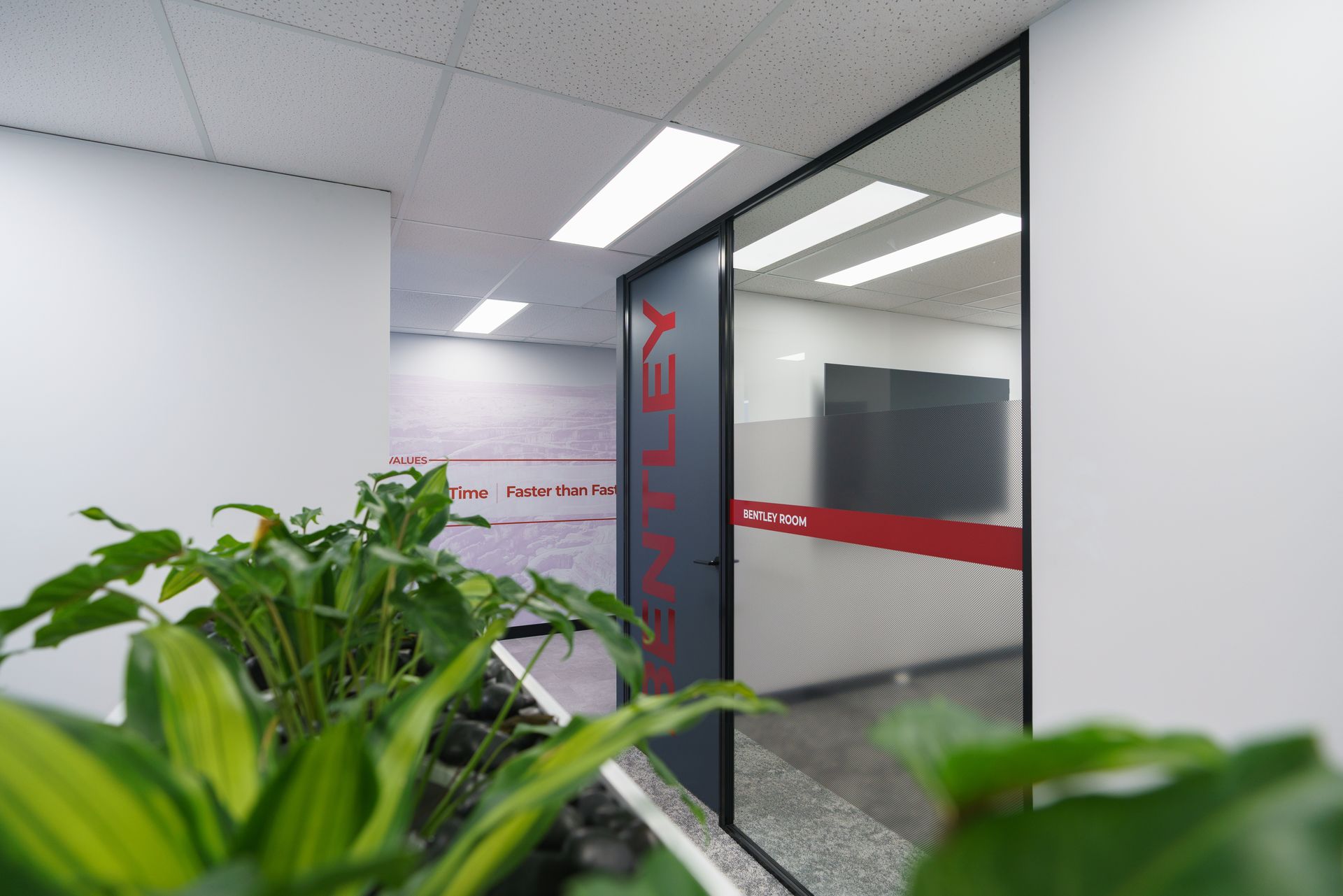
Design that reflects company values.
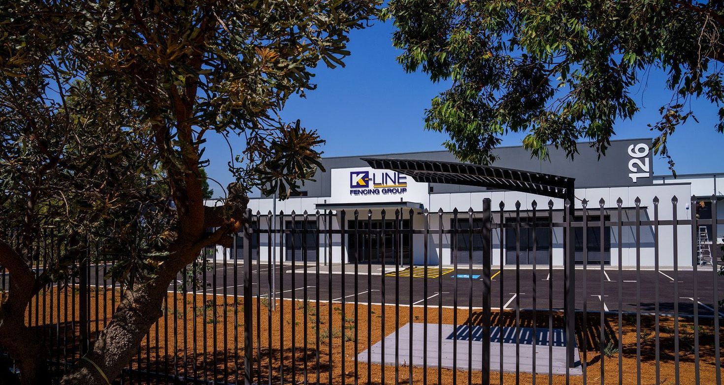
A blank canvas transformed into amazing new office spaces and a functional warehouse. The High Wycombe office and warehouse project focused on creating a functional and cohesive workplace that supports both administrative operations and industrial use within a large-scale facility. Working across an approximately 500 square metre footprint, the layout was designed to accommodate a mix of office spaces, meeting areas, and warehouse support zones, while allowing for future team growth. Clear planning ensured each area could operate efficiently while remaining connected as part of a unified workplace. The design centred on key zones including reception, boardroom and meeting spaces, private offices, open workstations, and staff breakout areas. Consideration was given to how teams move between office and warehouse functions, ensuring practical flow and day-to-day usability. Furniture, finishes, and feature elements were introduced to create a consistent and professional environment across all areas, while supporting the operational needs of a high-use workspace. The result is a well-structured facility that balances functionality and design, supporting both business operations and a more considered workplace experience.
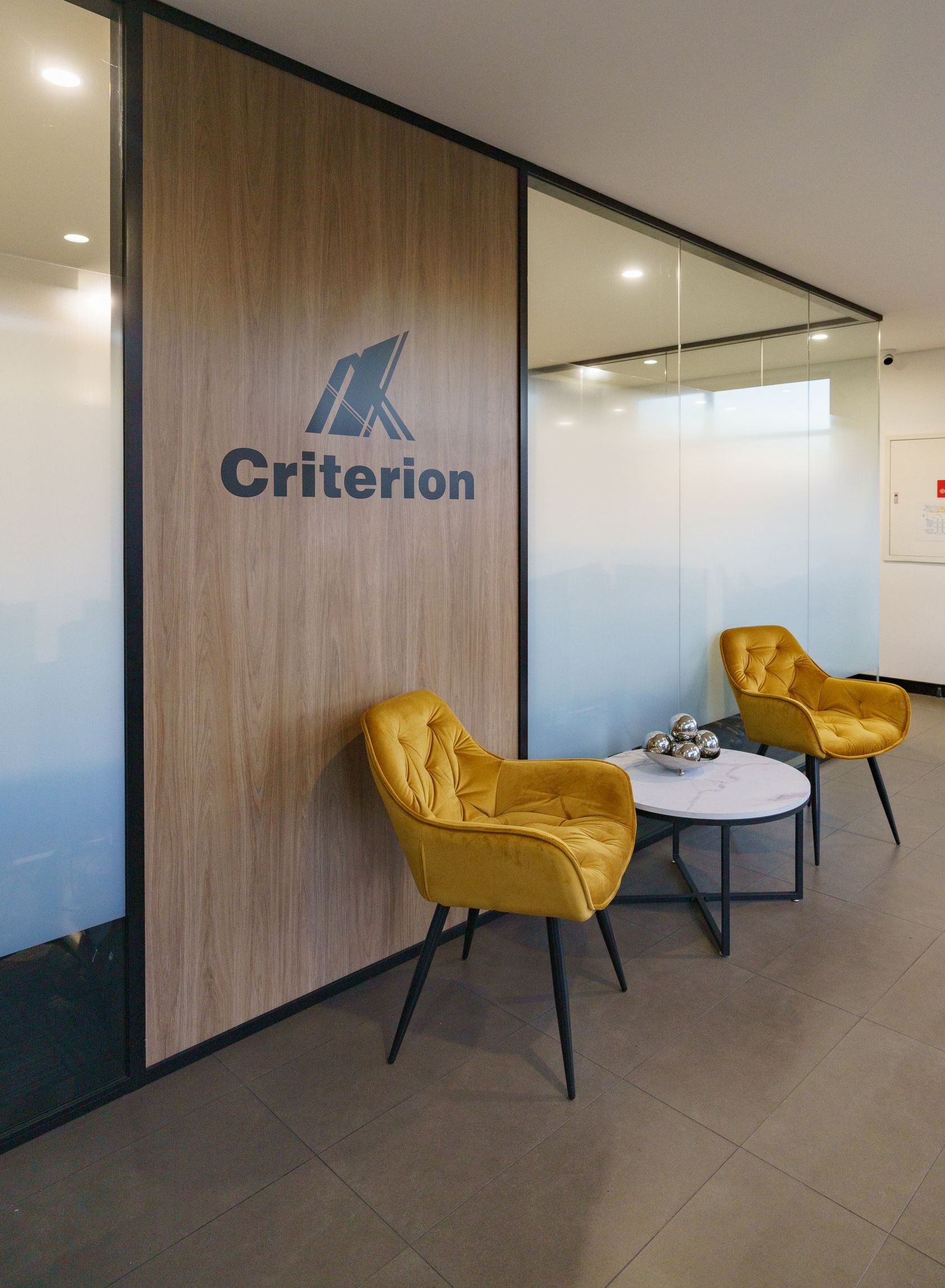
Compact - Functional - Efficient, yet contemporary office design. (131m2)
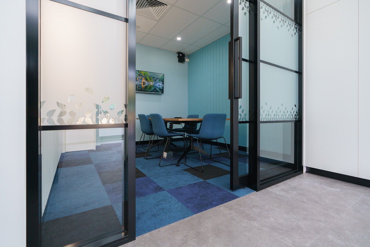
A complete renewal of vacant space to accommodate office staff in a bright and friendly atmosphere. (306m2)
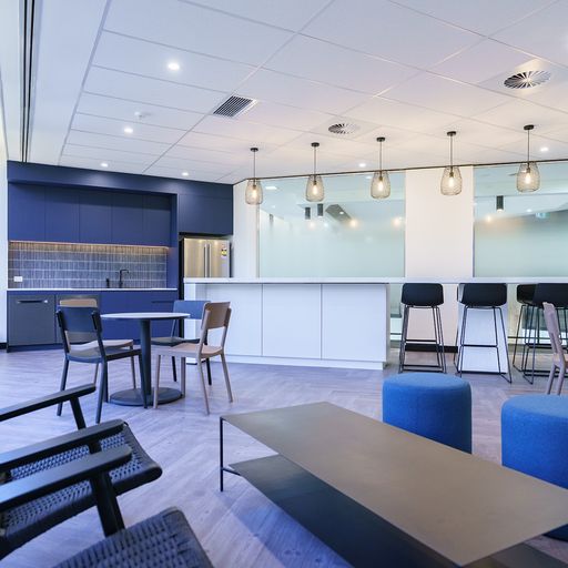
The brief for this new fitout was a blend of office and open plan workspace with modern staff facilities.
Retail & Hospitality
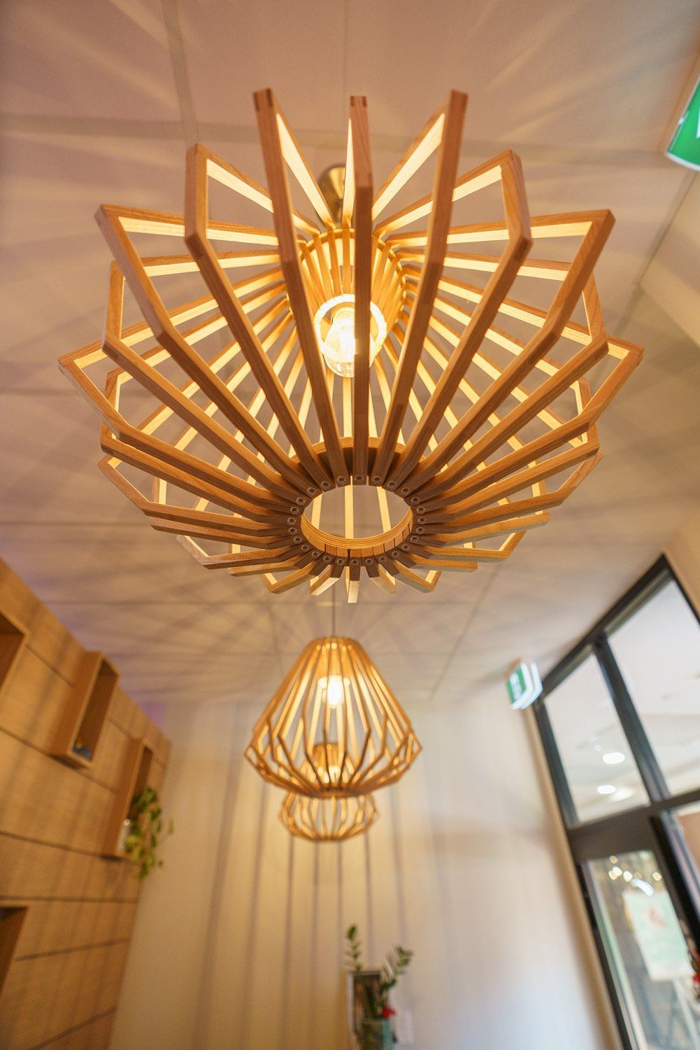
A traditional Thai healing practice that is charming, comfortable and relaxing.
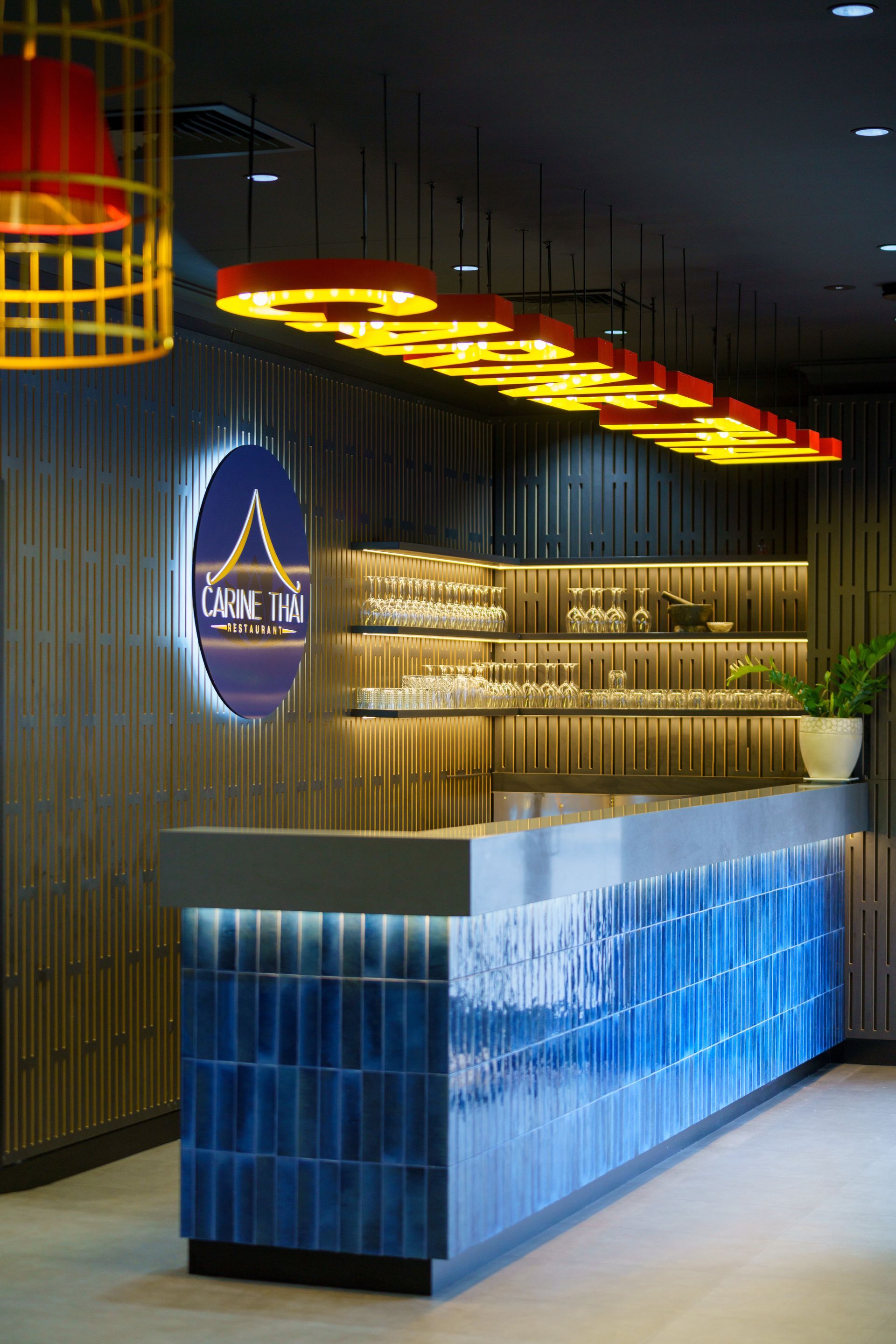
Designed around how the venue actually trades, the Carine Thai Cuisine fitout gives equal weight to guest comfort and service efficiency within a compact tenancy. Considered changes to the layout separated front-of-house dining from back-of-house operations and opened up the flow without adding to the footprint. The dining area now reads as a destination in its own right, comfortable and cohesive rather than compromised by its size. The Carine Thai Cuisine fitout works within a limited footprint, with the layout carefully planned to support both front-of-house dining and back-of-house operations, while maintaining a clear and intuitive flow throughout the space. The design centred on optimising key areas, including customer seating, service zones, and kitchen support spaces. Circulation was considered to ensure smooth movement for both staff and guests, allowing the space to operate efficiently during peak service periods. Lighting and shopfront elements were introduced to strengthen the presence of the restaurant within the centre, contributing to a more inviting and defined identity. The result is a well-resolved fitout that maximises usability within the available space, supporting efficient operations while delivering a comfortable dining experience, delivered through one team, accountable from first concept to handover.

A bright, classy and clinical finish was achieved through the use of clean lines and 3-dimensional, high gloss panels.
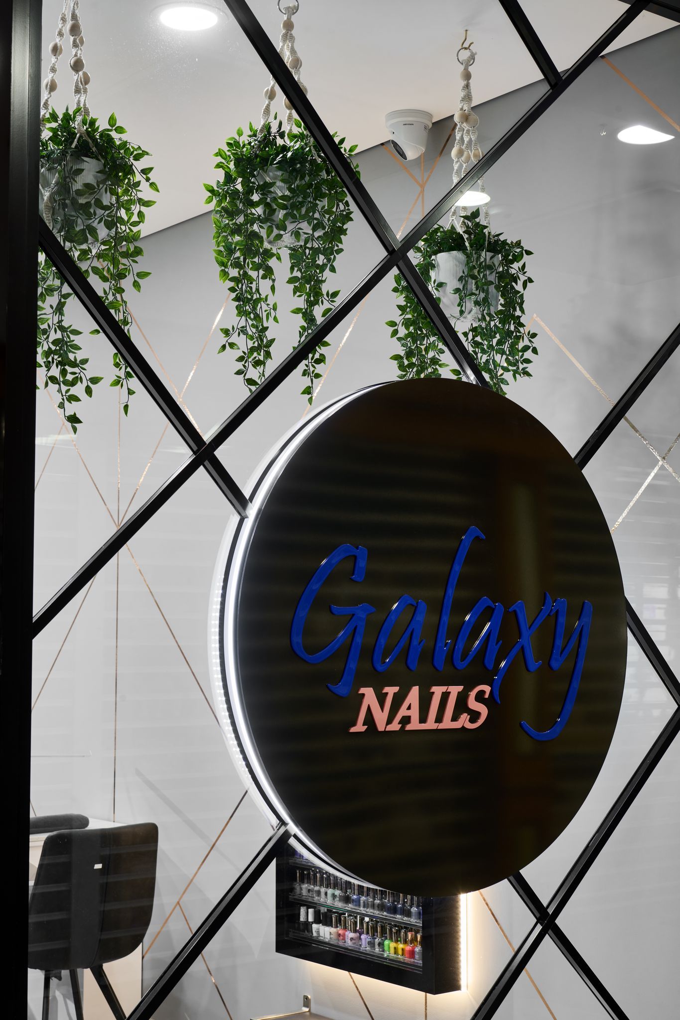
A modern, lush and luxurious space was the client's brief for this retail space. The internal space had to be bright and open to allow for high patronage and turnover.